Docusaurus Authentication using Google Firebase
A guide on how to add authentication to your Docusaurus website utilizing Google Firebase
• High-performing, certified full-stack developer and data scientist with 6+ years of software development experience. • Expert in delivering IT solutions for financial services leveraging the latest tools & frameworks.
Background
Docusaurus is an excellent documentation generator tool that doesn’t support authentication out of the box. If you want to read about the roadmap of this issue and get to know more about what we want to achieve, please refer to my main article here.
Goal
The main goal of this article is to provide a step-by-step guide on how to add a simple authentication layer to Docusaurus using Google Firebase.
Please find the more advanced authentication flows using Docusaurus and Google Firebase here.
Getting Started
Before starting the tutorial, I assume you have a basic understanding of React and how Docusaurus works.
Prerequisite
A Google Firebase account
A running Docusaurus website using the steps provided in the main website
Installing packages
After initializing your Docusaurus project, it is time to install the necessary packages:
npm i firebase@^9.22.0 react-firebaseui@^6.0.0 docusaurus-plugin-dotenv@^1.0.1
The command above will install a few packages respectively:
firebase: Firebase JavaScript library for web and Node.jsfirebaseui: The Firebase UI library used in the login pagedocusaurus-plugin-dotenv: A Docusaurus plugin that allows you to access your environment variables
Update docusaurus.config.js
Go to your docusaurus.config.js file and update the plugins list:
// docusaurus.config.js

plugins: [
    [
      "docusaurus-plugin-dotenv",
      {
        path: "./.env.local",
        systemvars: true,
      },
    ],
  ],
❗️Be careful about the below points regarding the above configuration:
pathwill look for the.env.localfile which is needed for test purposes on your local machine.
systemvarsshould be set totrueif you would rather load all system variables as well (useful for CI purposes). If it is not the case for you, please set it asfalse.
Google Firebase Setup
In this section, we will see how to create a Google Firebase to satisfy the requirements.
Go to the Google Firebase console. If prompted, enter your credentials.
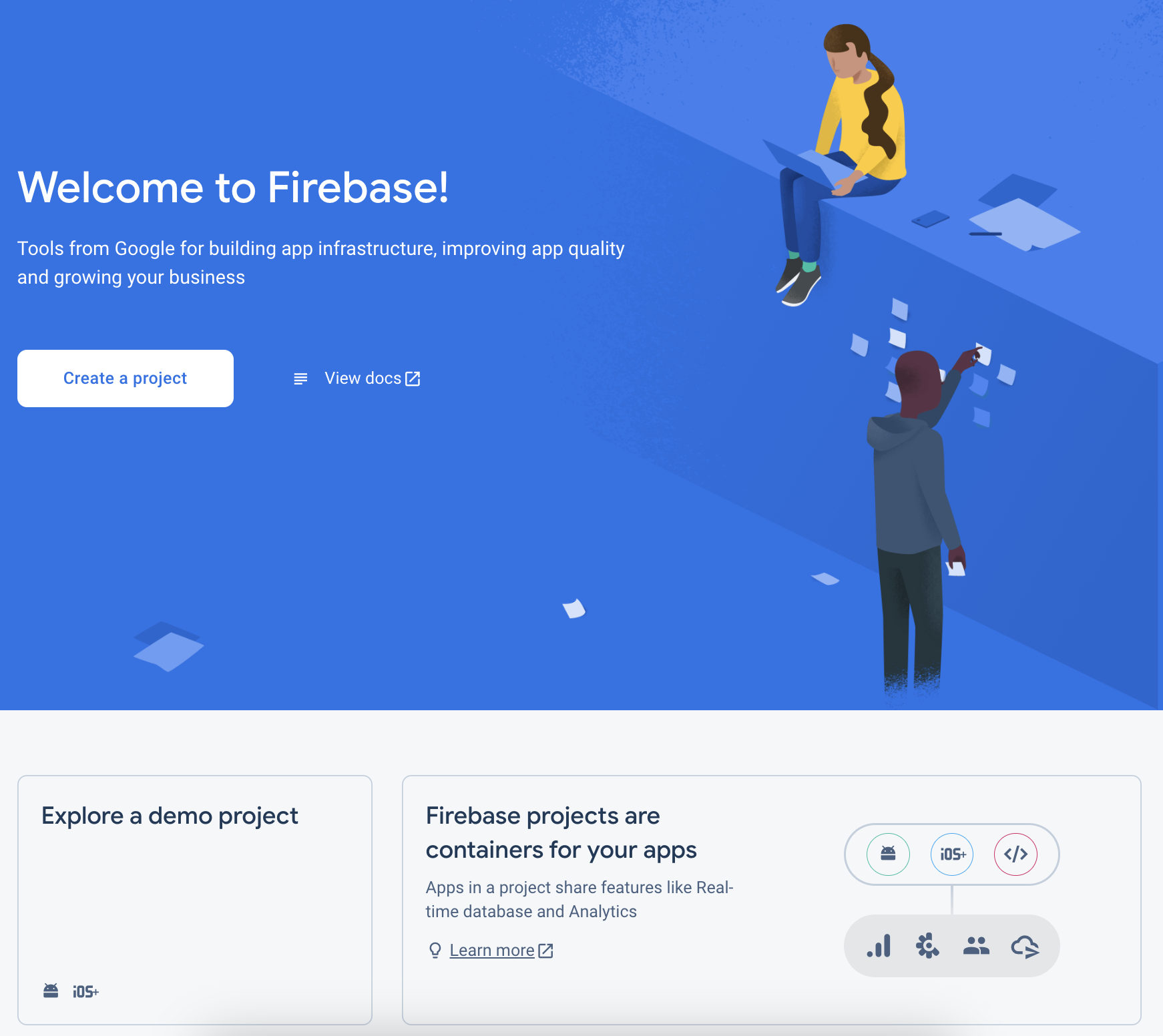
Click Create a project.
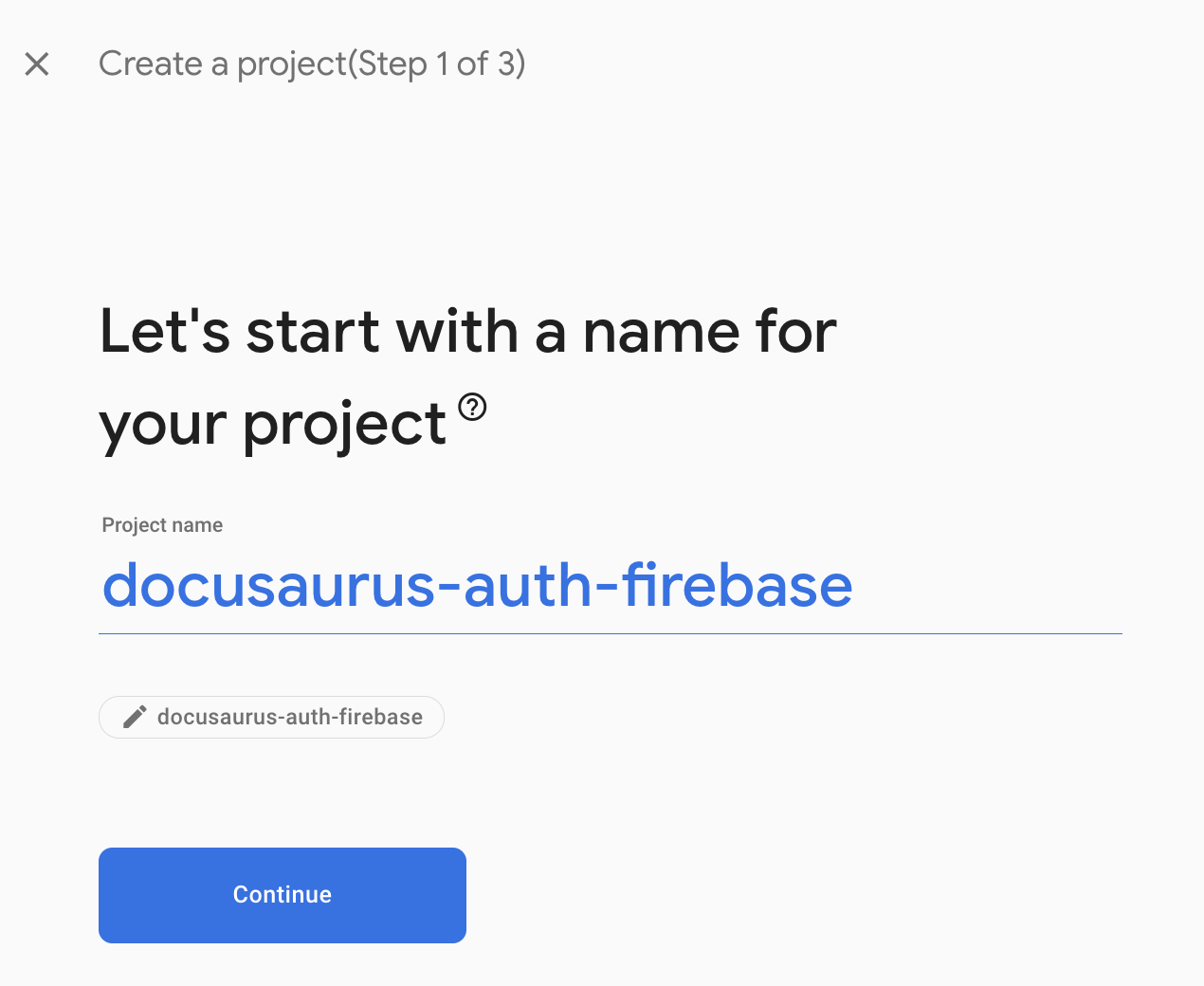
In Create a project (Step 1 of 3), enter a unique Project name and press Continue.
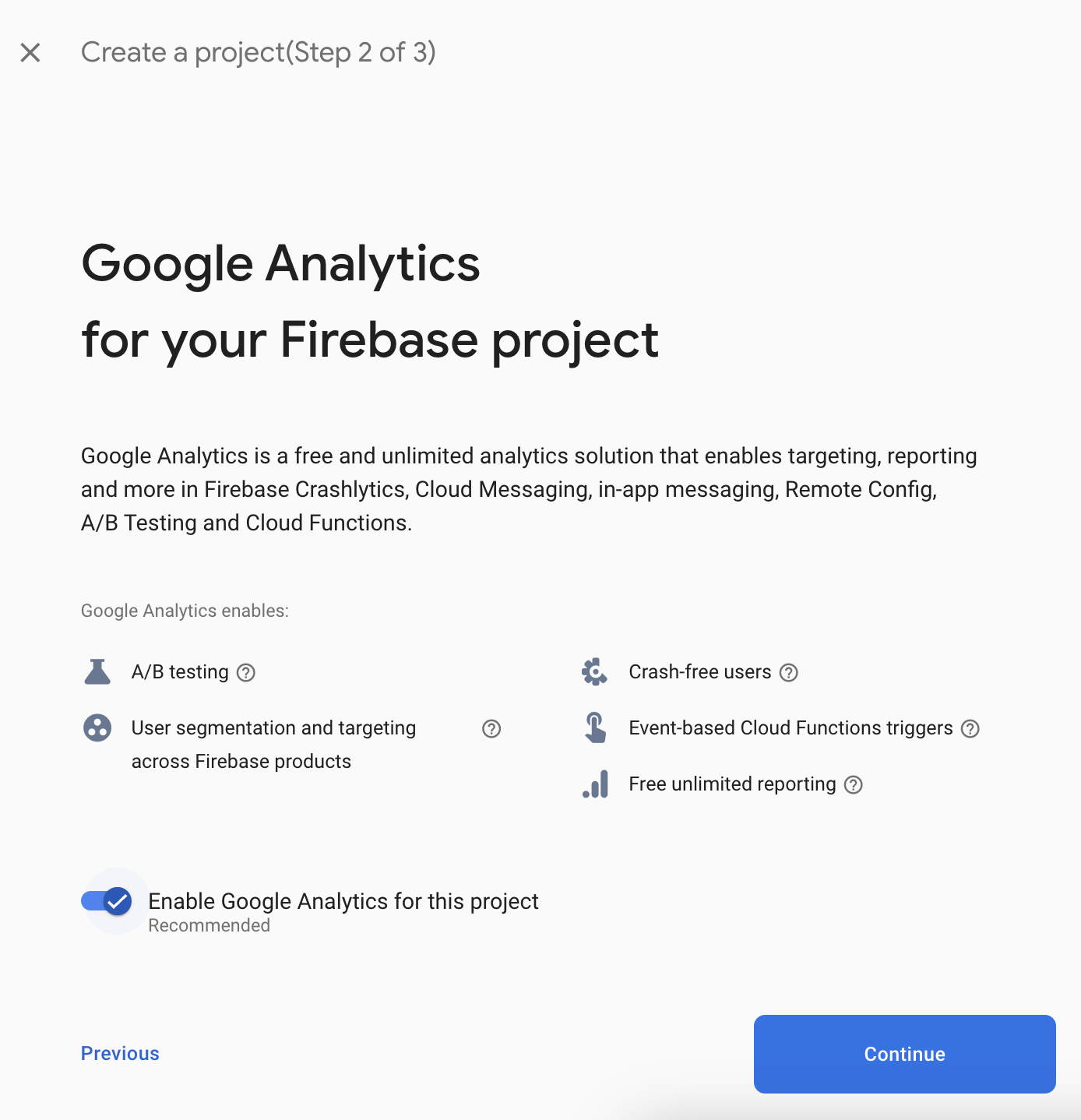
In Create a project (Step 2 of 3), no need to change anything, just press Continue.
In Create a project (Step 3 of 3), change based on your needs or leave as default and press Create Project.

Now you are in the Firebase project dashboard and it is time to create a web app in the Firebase project.
Click on the button highlighted in the image below:
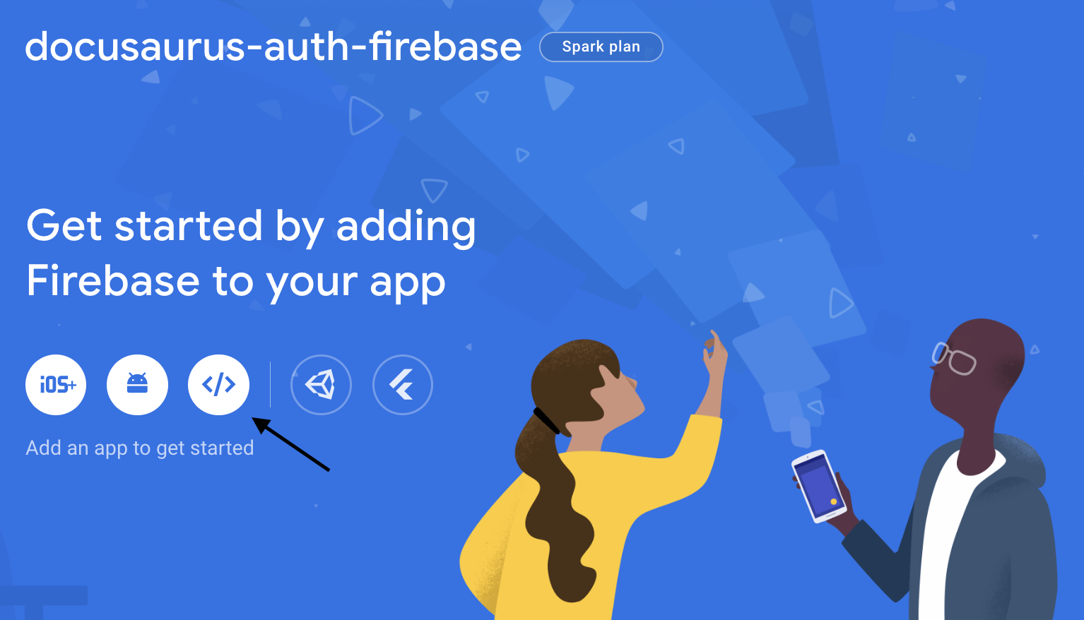
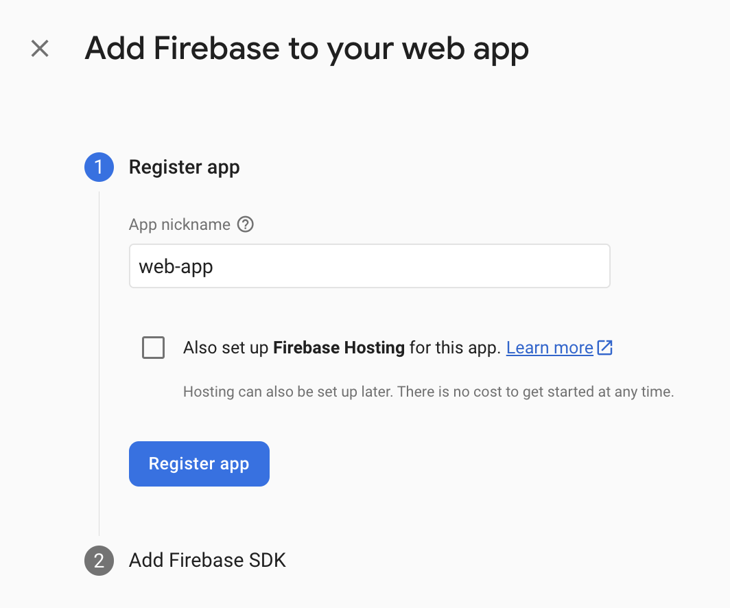
In Step 1 (Register app), fill up the App nickname and click on Register app.
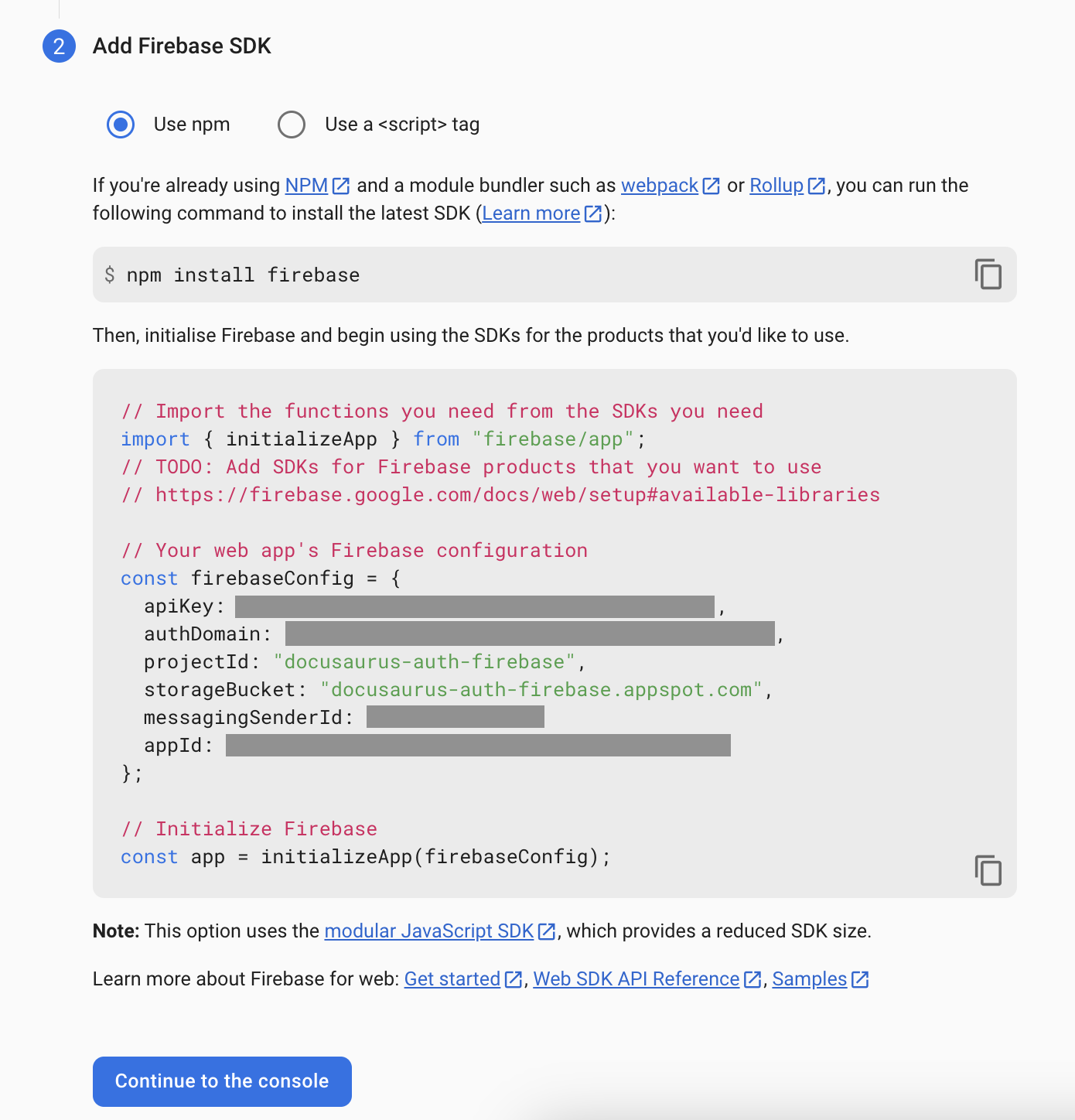
In Step 2 (Add Firebase SDK), note down the information provided and press Continue to the console.
Let's add the Authentication service to our app.
Click on the button highlighted in the image below:
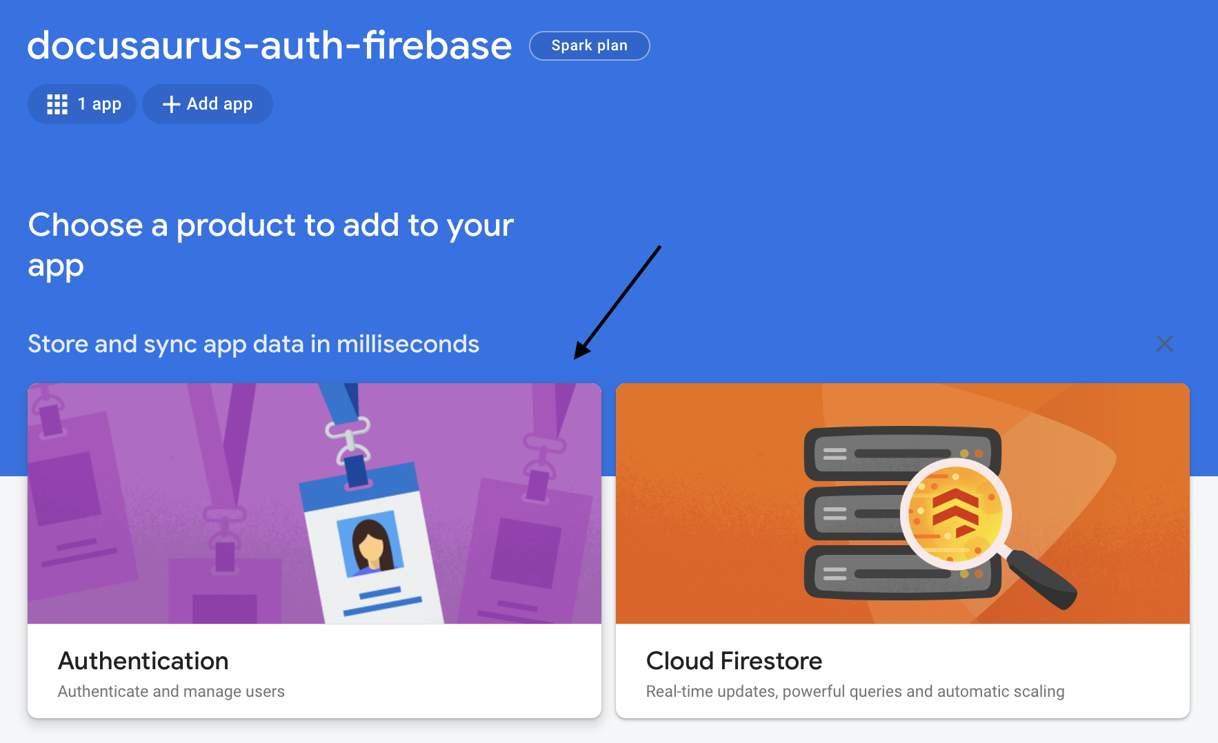
Click on Get Started.

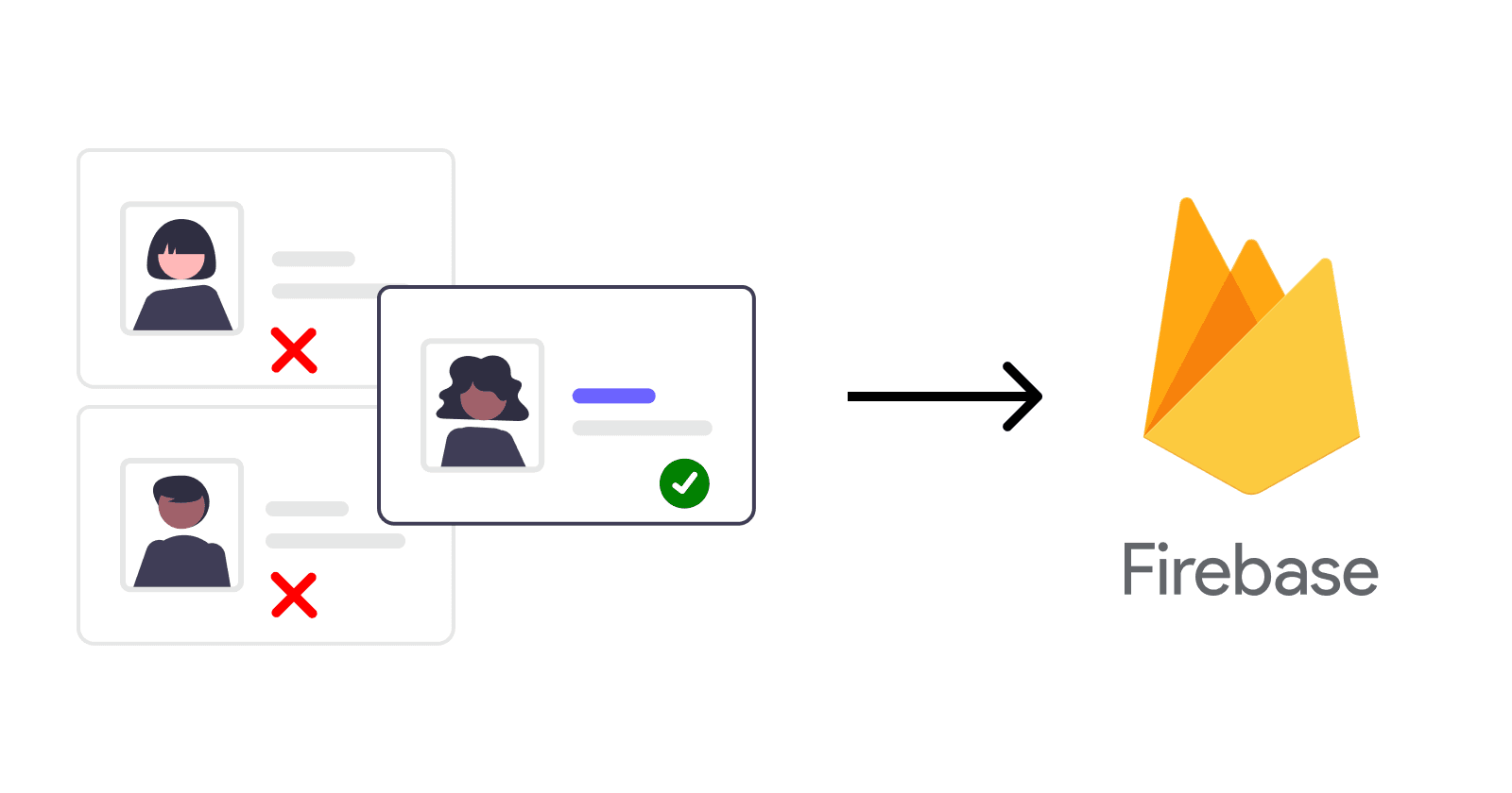
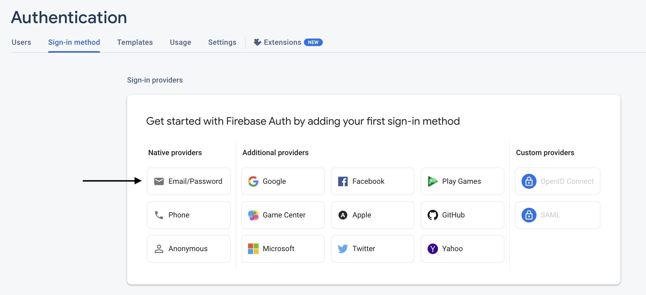
We want to let the user to sign0in using email so on the section Sign-in method, click on Email/Password.
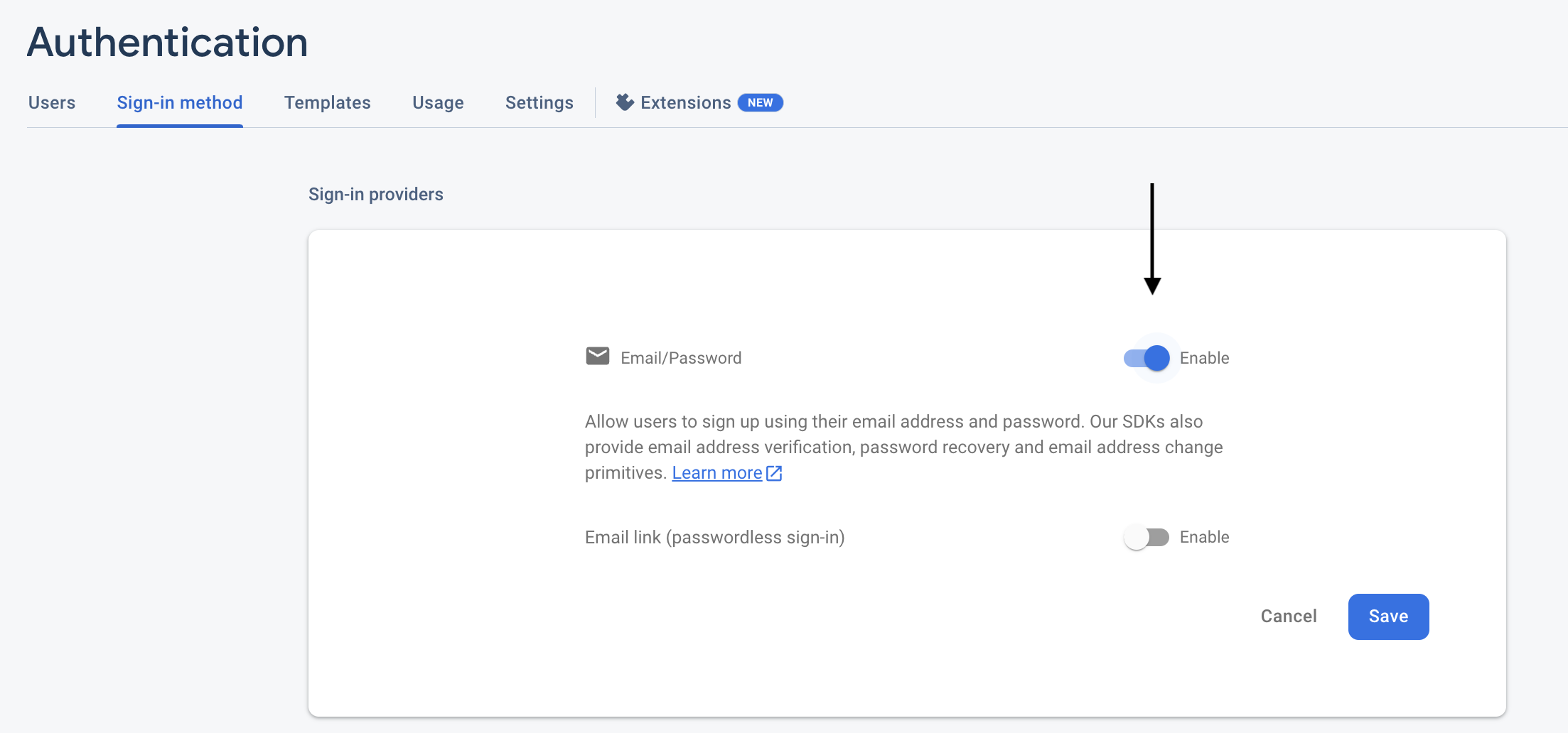
In the section Sign-in providers, enable Email/Password and press Save.
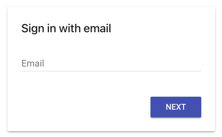
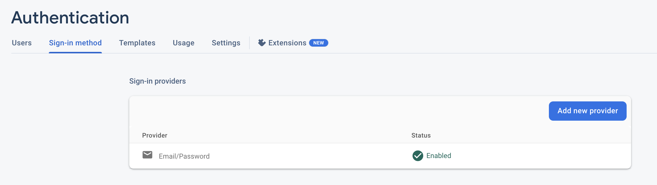
As you see, now the users can sign in using email and password.
Docusaurus Setup
This section contains all the changes and new files needed to be added to the Docusaurus website. I suggest going through the previous steps to set up your Google Firebase before starting this section.
Final Directory Hierarchy
Here is the final directory tree which mostly shows the changes added/modified to the Docusaurus project. Use it as a reference.
├── docusaurus.config.js
└── src
   ├── components
   |  ├── Auth
   |  |  └── index.js
   |  ├── Loading
   |  |  ├── index.js
   |  |  └── styles.css
   |  └── Login
   |     ├── index.js
   |     └── styles.css
   ├── config
   |  └── firebase-config.js
   ├── theme
   |  ├── Navbar
   |  |  ├── Content
   |  |  |  ├── index.js
   |  |  |  └── styles.module.css
   |  |  └── MobileSidebar
   |  |     └── PrimaryMenu
   |  |        └── index.js
   |  └── Root.js
   └── utils
      ├── constants.js
      └── utils.js
Docusaurus Swizzling
Docusaurus has an advanced feature called Swizzling which allows the developer to go deeper into the Docusaurus lifecycle and provides more flexibility to the developer.
To make our website be able to utilize sign-up/sign-in flow, we need to swizzle three components:
ROOT: The
<Root>component is rendered at the very top of the React tree, above the theme<Layout>, and never unmounts. It is the perfect place to add stateful logic that should not be re-initialized across navigation (user authentication status, shopping cart state...).Navbar: To show the Login/Logout button in the Navbar on top of the website.
Desktop: To show the button in the Desktop view.
Mobile: To show the button in the Mobile view.
To swizzle the above components, you may use the instruction from Docusaurus or follow my guide to add the required files.
Check here for the final directory hierarchy.
Adding Required Files
This section will provide the changes or additional files required for this project.
🔔 On the first line of each code block, you can find the relative path of the file.
Environment variables: Contains all the variables used in the application. I've provided some explanations for each variable.
## .env.local # For Auth / General Use FIREBASE_API_KEY="AIzaSyAzYEmBbxkJQf_0uY74LGorforh-76edW8" # The main domain for Firebase authentication FIREBASE_AUTH_DOMAIN="docusaurus-auth-firebase.firebaseapp.com" # Firebase project ID FIREBASE_PROJECT_ID="docusaurus-auth-firebase" # The storage used in the project (indirectly) FIREBASE_STORAGE_BUCKET="docusaurus-auth-firebase.appspot.com" # Messaging service for the default app or a given app MESSAGING_SENDER_ID="775832995743" # The App ID for the Docusaurus website integration APP_ID="1:775832995743:web:b11820b8cea5587480dfaa"firebase-config.js: Contains the definitions needed to set up Google Firebase.
// src/config/firebase-config.js export const firebaseConfig = { apiKey: process.env.FIREBASE_API_KEY, authDomain: process.env.FIREBASE_AUTH_DOMAIN, projectId: process.env.FIREBASE_PROJECT_ID, storageBucket: process.env.FIREBASE_STORAGE_BUCKET, messagingSenderId: process.env.MESSAGING_SENDER_ID, appId: process.env.APP_ID, };Root.js: Here we wrap the main
<Root>component using a custom component called<AuthCheck>.// src/theme/Root.js import React from "react"; import { AuthCheck } from "../components/Auth"; export default function Root({ children }) { return <AuthCheck children={children} />; }Auth: In this file, we check if the route requested is private or not.
If the route is protected and the user is
authenticatedmeansuservariable has a value, it will redirect to the requested page.If the route is protected and the user is not
authenticatedmeansuservariable does not have a value, it will redirect to the login page.If the route is
loginorlogout, it will redirect to the base URL.Otherwise, the path is not protected and will redirect to the requested page.
🔔 We show a loading animation while we wait for the Firebase to authenticate the user.
 // src/components/Auth/index.js

 import React, { useEffect, useState } from "react";

 import firebase from "firebase/compat/app";
 import { onAuthStateChanged, signOut, getAuth } from 'firebase/auth';

 import { Redirect, useLocation } from "@docusaurus/router";

 import { firebaseConfig } from "../../config/firebase-config";
 import { Login } from "../Login";
 import Loading from "../Loading";
 import { BASE, LOGOUT_PATH, LOGIN_PATH, PROTECTED_PATHS } from "../../utils/constants";

 firebase.initializeApp(firebaseConfig);

 export const auth = getAuth();

 export function AuthCheck({ children }) {
     const [user, setUser] = useState(null);
     const [authLoading, setAuthLoading] = useState(true);

     useEffect(() => {
         onAuthStateChanged(auth, (user) => {
             setUser(user);
             setAuthLoading(false);
         });
     });

     const location = useLocation();
     let from = location.pathname;

     if (authLoading) return <Loading />;

     if (user?.email) {
         if (from === LOGOUT_PATH) {
             signOut(auth);
             return <Redirect to={BASE} from={LOGOUT_PATH} />;
         } else if (from === LOGIN_PATH) return <Redirect to={BASE} from={from} />;

         return children;
     } else {
         if (from === LOGOUT_PATH) return <Redirect to={BASE} from={from} />;
         else if (PROTECTED_PATHS.filter(x => from.includes(x)).length) return <Login />;
         else if (from === LOGIN_PATH) return <Login />;
         return children;
     }
 };
Login: This page will be shown when the user needs to log in or be redirected to
/loginpage. Additionally, I wrote a CSS file tied to this page that aligns the login component vertically in the page.// src/components/Login/index.js import React from "react"; import { auth } from "../Auth"; import StyledFirebaseAuth from 'react-firebaseui/StyledFirebaseAuth'; import firebase from 'firebase/compat/app'; import 'firebase/compat/auth'; import './styles.css'; // Configure FirebaseUI. export const uiConfig = { signInOptions: [ firebase.auth.EmailAuthProvider.PROVIDER_ID, ], }; export function Login() { return <div className="auth-wrapper"> <StyledFirebaseAuth uiConfig={uiConfig} firebaseAuth={auth} /> </div>; };/* src/components/Login/styles.css */ .auth-wrapper { margin: auto 10px; }Loading: This is a ready-to-use component that shows a loading animation while we are waiting for the Firebase to authenticate the user instead of showing a blank page. Additionally, there is a CSS file tied to this component.
🔔 You can use any loading animation you want.
  /* src/components/Loading/index.js */

  import React from "react";
  import PropTypes from "prop-types";

  import "./styles.css";

  const Loading = (props) => {
    return (
      <div className="overlay">
        <div className="overlayDoor" />
        <div className="overlayContent">
          <div className="loader">
            <div className="inner" />
          </div>
        </div>
      </div>
    );
  };

  Loading.propTypes = {};

  export default Loading;
/* src/components/Loading/styles.css */ .overlay { position: fixed; top: 0; left: 0; width: 100%; height: 100%; z-index: 100000000; } .overlay .overlayDoor:before, .overlay .overlayDoor:after { content: ""; position: absolute; width: 50%; height: 100%; background: #111; transition: 0.5s cubic-bezier(0.77, 0, 0.18, 1); transition-delay: 0.8s; } .overlay .overlayDoor:before { left: 0; } .overlay .overlayDoor:after { right: 0; } .overlay.loaded .overlayDoor:before { left: -50%; } .overlay.loaded .overlayDoor:after { right: -50%; } .overlay.loaded .overlayContent { opacity: 0; margin-top: -15px; } .overlay .overlayContent { position: relative; width: 100%; height: 100%; display: flex; justify-content: center; align-items: center; flex-direction: column; transition: 0.5s cubic-bezier(0.77, 0, 0.18, 1); background: #fff; } .overlay .overlayContent .skip { display: block; width: 130px; text-align: center; margin: 50px auto 0; cursor: pointer; color: #fff; font-family: "Nunito"; font-weight: 700; padding: 12px 0; border: 2px solid #fff; border-radius: 3px; transition: 0.2s ease; } .overlay .overlayContent .skip:hover { background: #ddd; color: #444; border-color: #ddd; } .loader { width: 128px; height: 128px; border: 3px solid #222222; border-bottom: 3px solid transparent; border-radius: 50%; position: relative; animation: spin 1s linear infinite; display: flex; justify-content: center; align-items: center; } .loader .inner { width: 64px; height: 64px; border: 3px solid transparent; border-top: 3px solid #222222; border-radius: 50%; animation: spinInner 1s linear infinite; } @keyframes spin { 0% { transform: rotate(0deg); } 100% { transform: rotate(360deg); } } @keyframes spinInner { 0% { transform: rotate(0deg); } 100% { transform: rotate(-720deg); } }Navbar Desktop: Nothing changes on this component except we want to add
Login/Logoutto the Navbar.The reason we don't add the button using
docusaurus.config.jsis that the text should switch betweenLoginandLogoutbased on the fact that the user isauthenticatedor not.So, we override
useNavbarItems()function and use the modified function placedsrc/utils/utils.js.
Additionally, there is a CSS file tied to this page which is the original one captured from the swizzling component.The same change happens in
Navbar Mobileas well.// src/theme/Navbar/Content/index.js import React from 'react'; import { useThemeConfig, ErrorCauseBoundary } from '@docusaurus/theme-common'; import { splitNavbarItems, useNavbarMobileSidebar, } from '@docusaurus/theme-common/internal'; import NavbarItem from '@theme/NavbarItem'; import NavbarColorModeToggle from '@theme/Navbar/ColorModeToggle'; import SearchBar from '@theme/SearchBar'; import NavbarMobileSidebarToggle from '@theme/Navbar/MobileSidebar/Toggle'; import NavbarLogo from '@theme/Navbar/Logo'; import NavbarSearch from '@theme/Navbar/Search'; import styles from './styles.module.css'; import { useNavbarItems } from '../../../utils/utils'; // function useNavbarItems() { // // TODO temporary casting until ThemeConfig type is improved // return useThemeConfig().navbar.items; // } function NavbarItems({ items }) { return ( <> {items.map((item, i) => ( <ErrorCauseBoundary key={i} onError={(error) => new Error( `A theme navbar item failed to render. Please double-check the following navbar item (themeConfig.navbar.items) of your Docusaurus config: ${JSON.stringify(item, null, 2)}`, { cause: error }, ) }> <NavbarItem {...item} /> </ErrorCauseBoundary> ))} </> ); } function NavbarContentLayout({ left, right }) { return ( <div className="navbar__inner"> <div className="navbar__items">{left}</div> <div className="navbar__items navbar__items--right">{right}</div> </div> ); } export default function NavbarContent() { const mobileSidebar = useNavbarMobileSidebar(); const items = useNavbarItems(); const [leftItems, rightItems] = splitNavbarItems(items); const searchBarItem = items.find((item) => item.type === 'search'); return ( <NavbarContentLayout left={ // TODO stop hardcoding items? <> {!mobileSidebar.disabled && <NavbarMobileSidebarToggle />} <NavbarLogo /> <NavbarItems items={leftItems} /> </> } right={ // TODO stop hardcoding items? // Ask the user to add the respective navbar items => more flexible <> <NavbarItems items={rightItems} /> <NavbarColorModeToggle className={styles.colorModeToggle} /> {!searchBarItem && ( <NavbarSearch> <SearchBar /> </NavbarSearch> )} </> } /> ); }/* src/theme/Navbar/Content/styles.module.css */ /* Hide color mode toggle in small viewports */ @media (max-width: 996px) { .colorModeToggle { display: none; } }Navbar Mobile: Nothing changes on this component except we want to add
Login/Logoutto the Navbar.The reason we don't add the button using
docusaurus.config.jsis that the text should switch betweenLoginandLogoutbased on the fact whether the user isauthenticatedor not.So, we override
useNavbarItems()function and use the modified function placedsrc/utils/utils.js.The same change happens in
Navbar Desktopas well.// src/theme/Navbar/MobileSidebar/PrimaryMenu/index.js import React from 'react'; import { useThemeConfig } from '@docusaurus/theme-common'; import { useNavbarMobileSidebar } from '@docusaurus/theme-common/internal'; import NavbarItem from '@theme/NavbarItem'; import { useNavbarItems } from '../../../../utils/utils'; // function useNavbarItems() { // // TODO temporary casting until ThemeConfig type is improved // return useThemeConfig().navbar.items; // } // The primary menu displays the navbar items export default function NavbarMobilePrimaryMenu() { const mobileSidebar = useNavbarMobileSidebar(); // TODO how can the order be defined for mobile? // Should we allow providing a different list of items? const items = useNavbarItems(); return ( <ul className="menu__list"> {items.map((item, i) => ( <NavbarItem mobile {...item} onClick={() => mobileSidebar.toggle()} key={i} /> ))} </ul> ); }constants.js: This file contains the most important constant values giving easier management of the project.
// src/utils/constants.js export const LOGIN_PATH = '/login'; export const LOGOUT_PATH = '/logout'; export const AUTHENTICATED = 'authenticated'; export const BASE = '/'; export const LOGOUT_BUTTON = "Logout"; export const LOGIN_BUTTON = "Login"; // Add the protected paths here export const PROTECTED_PATHS = [BASE];utils.js: Contains a function to add
Login/Logoutbuttons to the Navbar.// src/utils/utils.js import React, { useEffect, useState } from "react"; import firebase from "firebase/compat/app"; import { onAuthStateChanged } from "firebase/auth"; import { useThemeConfig } from "@docusaurus/theme-common"; import { LOGIN_BUTTON, LOGIN_PATH, LOGOUT_BUTTON, LOGOUT_PATH, } from "./constants"; export function useNavbarItems() { const [user, setUser] = useState(null); useEffect(() => { onAuthStateChanged(firebase.auth(), (user) => { setUser(user); }); }); let label, to; if (user) { label = LOGOUT_BUTTON; to = LOGOUT_PATH; } else { label = LOGIN_BUTTON; to = LOGIN_PATH; } // TODO temporary casting until ThemeConfig type is improved // return useThemeConfig().navbar.items; let items = useThemeConfig().navbar.items; items.push({ label: label, position: "right", to: to, }); // remove irrelevant items if (user) items = items.filter((x) => x.label !== LOGIN_BUTTON); else items = items.filter((x) => x.label !== LOGOUT_BUTTON); const uniqueItems = [...new Map(items.map((x) => [x.label, x])).values()]; return uniqueItems; }
Source Code
You may find the complete source code of this project here.
🔔 The code repository shared above consists of a few branches that all are related to the Docusaurus Authentication using Google Firebase. Though, you can find the changes for this article in the branch called
main.
❗️DO NOT upload any
.envto your public repository.To run the project on your machine, you only need to fill up the
.env.localfile as described WITH YOUR VALUES.To use your
.envvalues in production, you need to add them to your hosting.Below I listed a few hosting options and how you can upload your
.envvariables as well.
Authentication for Specific Route
Please refer to it here.
Authentication using Social Providers
Please refer to it here (coming soon).
Adding limitation to SignUp/SignIn flow
Please refer to it here (coming soon).
Complete Docusaurus Authentication Series
Please find the complete roadmap here.
In this series, I will provide a step-by-step guide on how to add an authentication layer to your Docusaurus website using well-known auth providers like AWS Cognito, Google Firebase, Auth0, etc.
Also, you can find more advanced auth flows for complicated scenarios as well.
Support
In the end, if you find the articles useful, don’t forget to support me at least with a message :)